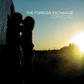
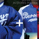
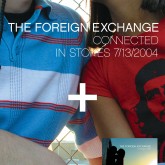
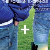
8 years ago today, Foreign Exchange’s “Connected” dropped.
@fwmj designed the cover &@arellefelice was on it. Virgin sold it for $16.88…— Dart_Adams (@Dart_Adams) August 24, 2012
@Dart_Adams reminded me that 8 years ago today, The Foreign Exchange’s Connected album was released on Barely Breaking Even Records. Wow, time flies.
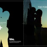
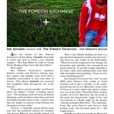
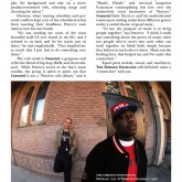
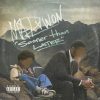
After being introduced to the members of Little Brother by @slopfunkdust and designing the cover for Little Brother’s ABB Records debut The Listening, Phonte and Nicolay asked me to handle the artwork for Connected. We all pretty much decided the artwork should be clean and not overly photoshopped (which at the time was par for the course amongst Hip Hop releases), just as the duo’s music sounded clean, to the point and unpretentious. As with most of the music Phonte was involved in that I was asked to design for, he pretty much made the decisions on what he wanted to see, gave a starting point, and then gave me free reign to interpret that and make it my own.
The good ole days; where people trusted you to do the job they brought you on for. Rappers rapped, producers produced, and designers designed without crap input from people that didn’t think visually. That’s another post entirely.

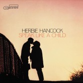
Phonte suggested Speak Like A Child as the starting point, and wanted a homage to the album cover’s simplicity in message. Around this time I was still frequenting record stores, spending most of my time in the import Drum n Bass, Jungle, House and Techno sections. Most of this vinyl was coming from overseas which had a hard on for crisp photography and/or Vir2L-esque esoteric 3d models of futuristic, yet functionless, robotics/mechanics (essentially the overly busy glitch hop/dub step of graphic design aesthetics at the time), Helvetica, Univers, and similar typefaces, and an overwhelming allegiance to Swiss grid systems/aesthetic in general. Essentially (and whether right or wrong), I understood this as the electronic music artists and labels’ (that catered to a rave culture on it’s last leg) take on mid century Blue Note album covers.
A sharp photo, clean type, lots of negative space—you know.
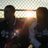
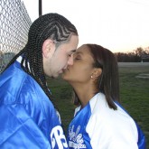
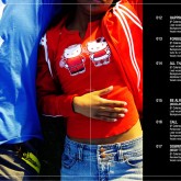
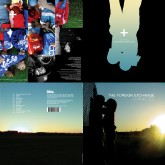
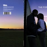
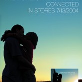
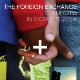
Playing on the duo’s name, the nature of their trans-atlantic, cross cultural collaboration, and my deep seeded desire for people from different walks of time, life, opportunity and interests to be able to get along, come together when it made sense, and create things of importance, or at the very least of a contextual importance, I decided to use my younger sister Arelle and her boyfriend Daniel as the characters for my version of Speak Like A Child.
At the time, my sister Ari and Daniel’s relationship was one of the more stable, productive, and caring relationships I’d witnessed any of my friends, and in this case my sibling, take part in. This was the first of her high school or college age boyfriends she brought home that I didn’t want to punch square in the chest. He also had a good jump shot, and didn’t play basketball selfishly; one of my simplistic barometers for a person’s personality, how do they carry themselves on the court in a game of pick up basketball.

With the cover for Connected, I wanted to address, or at the very least allude to, some of these themes of cross cultural and cross regional exchange, in the most obvious (in American society, anyway) way possible given the parameters of the project; an “interracial” couple embracing, that would still have a layer or three beneath that surface that could catalyse a little bit of dialogue. This is the age of the internet coming to real prominence in the creation and conceptualization of Hip Hop music, allowing regions that never really got to interact without the larger than life budget or a major label behind them to create music together. Netherlands, to New York, To North Carolina to the DMV. Nicolay, Von Pea, Oddisee, Joe Scudda, Phonte and more. Creating collaborative music together remotely is an every day thing these days, but back then it was still uncharted territory, and a point at which to hinge a marketing plan around.
Daniel is Puerto Rican and my sister Black American. My sister and I have the same parents. For personal reasons, I identify simply as Black over anything else,
but I’m (my sister too obviously) 1/16th Puerto Rican, 1/16th Jamaican, a negligible (and perhaps at this point untraceable and unverifiable) amount Jewish, and Louisiana plantation Negro on my father’s side. My mother’s family is from Richmond, but she’s somewhere on the scale between brown and light skinned, with relatively straight hair. I didn’t then and don’t now know the Daniel’s family’s generational breakdowns at all.
I don’t know much about my mother’s family the generations before her and her siblings, as we’ve never talked about it at length, but there’s no telling what accounts for her and her brothers’ ‘straight’ hair and ‘fair’ skin. First Peoples Ancestry? White European Ancestry? No telling, and I’ve made few attempts to exoticise my cultural and ethnic face card in life (as any times I may have considered it, the “one drop” rule always prevailed), but as any self aware person, my family’s make up and our classification in US American society crosses my mind often. After stains of the middle passage on my psyche and all that.

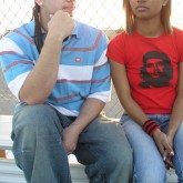
It’s a funny thing the way race and ethnicity and cultural belonging is interpreted in America and in Hip Hop. I couldn’t recount the number of #thatsite posts from trolls and dissenters throwing shade on Nicolay’s production (“too many cheesy synths!” “where’s the thick basslines?” “he doesn’t sample enough!” “he’s not 9th Wonder!”) simply because he was from the Netherlands and not black (or pretty much any non black participant in our conversations on rap music and black culture). Or even Phonte’s initial, yet brief, hesitation to using the photos of my sister kissing someone that wasn’t black, until I explained what and why I was thinking. Or my own personal quest to find the most “atypical” (whatever that means) interracial pairing I could for the cover, before convincing Ari and Daniel to model for me. Some of my by-a-long-shot considerations were a latino man and a desi woman, an asian man and a red haired white woman, a desi man and a dark skinned black woman. Alas, my pool of volunteer models was relegated to my course mates in college (who were either too shy to be on camera, or didn’t look authentically into Hip Hop to me at the time), so my sister and Daniel were the logistical choice, and it turned out well.


The album was generously received, thanks to Phonte’s skillful songwriting and Nicolay’s clean and exacting production, appropriately placed features (Oddisee, Von Pea, Kenn Starr, Darien Brockington, Median, and more), and the equally as crisp packaging and branding. For those that were closely following Phonte’s music in the underground in those years (hello Drake), Nicolay’s instrumentals were the perfect pairing for him to venture out and display some of his other musical talents and influences that didn’t fit neatly in the boom bap hip hop box that many of his fans expected him to be the scion of.

The Connected album is the cornerstone that the house of The Foreign Exchange Music was built upon, and it’s branding as much so. While, I haven’t had a hand in artwork for the collective since 2007’s Here album and 2008’s Time:Line record, their aesthetic employed now is still consistent with that of which I established for them back in 2003.
I wish I could have seen the promo posters plastered all over NYC when this album was released.
Good times.
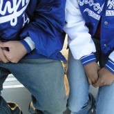
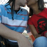
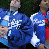
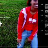
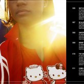
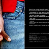
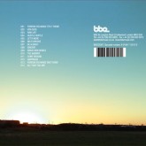
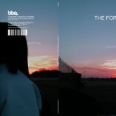
Below are some extras and source files I found in a forgotten folder on my server from the Connected days. I took the photos for the Connected CD and LP using my mother’s 3.2 mexapixel Sony Camera along the chain link fence behind the northern end zone on the football field at my high school alma mater, Samuel Clemens High School in Schertz, Texas. For the Connected EP, Sampler, and Instrumentals, I had access to a 6+ megapixel camera so the photos were a lot sharper.
Enjoy!


